
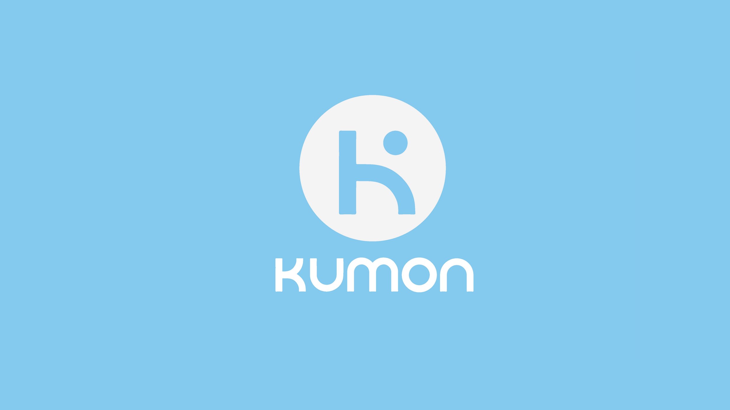
Kumon Rebranding
Kumon Rebranding
Kumon Rebranding

About The Project
Kumon is a brand that began in Toyko by a father who created a program for his son. This spread throughout the community and is now the largest math and reading center in the world. They help kids foster a love of learning and develop good study habits and self-learning abilities.
I decided to rebrand because they aren’t cohesive across all platforms, currently not promoting all of their services. Most importantly they don't feel like a child-centered brand.
In the rebranding, we will emphasize the positive feeling the children will feel after learning a new concept. And create a design system to carry out through all aspects of the company.


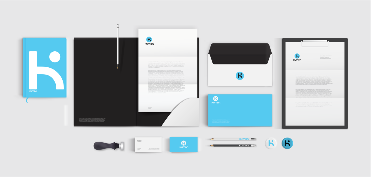
Design Story
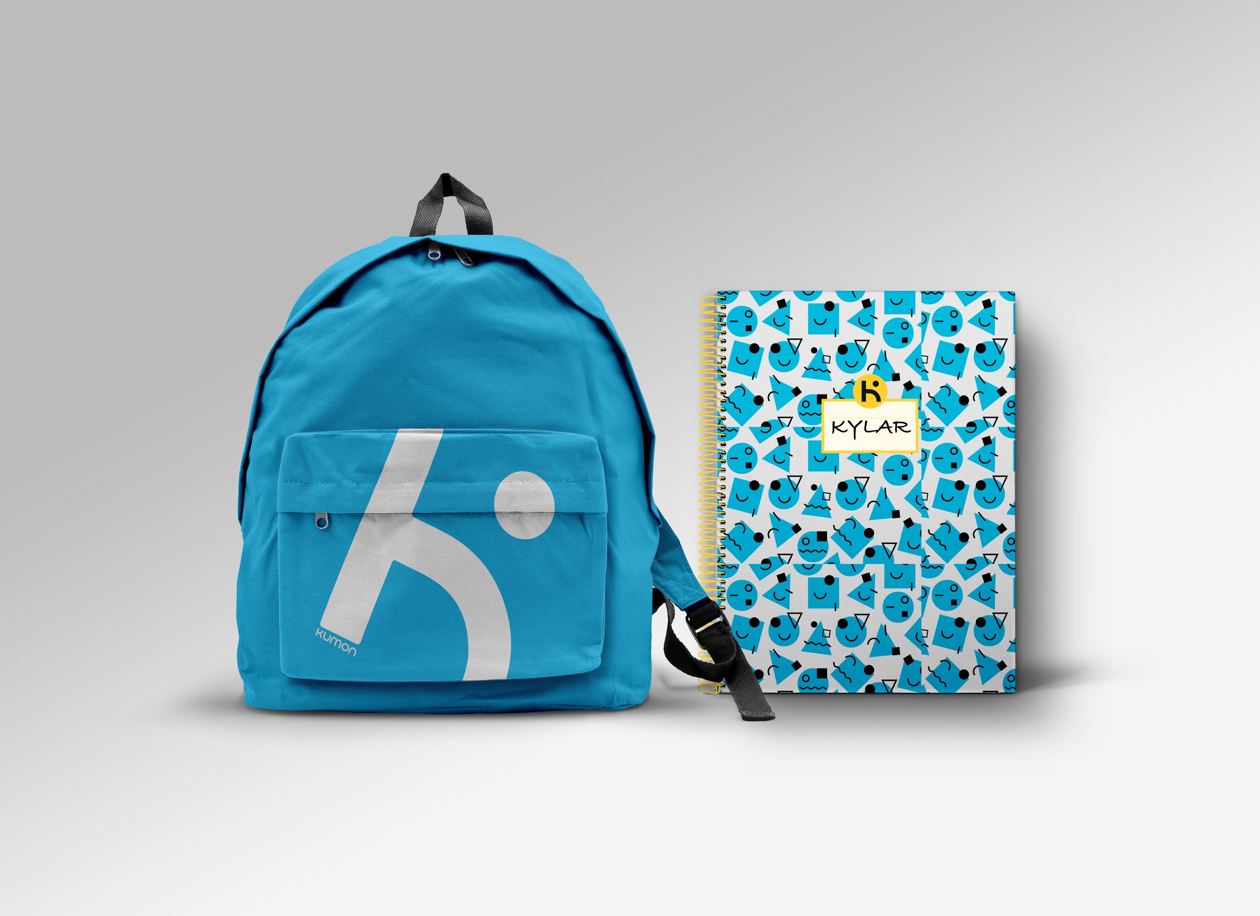
Kumon’s has been in business for over 60 years, their current branding has key aspects that should remain the same. Some elements I want to keep are the blue but make it slightly more vibrant for a fun and playful feel while also still being a calm color. Yellow was a color I felt balanced the blue to make it feel less cold especially because it’s a physical environment they have to enter and feel comfortable in. Kumon is also infamous for the face and so I wanted to keep the faces Kumon is known for but add variety.


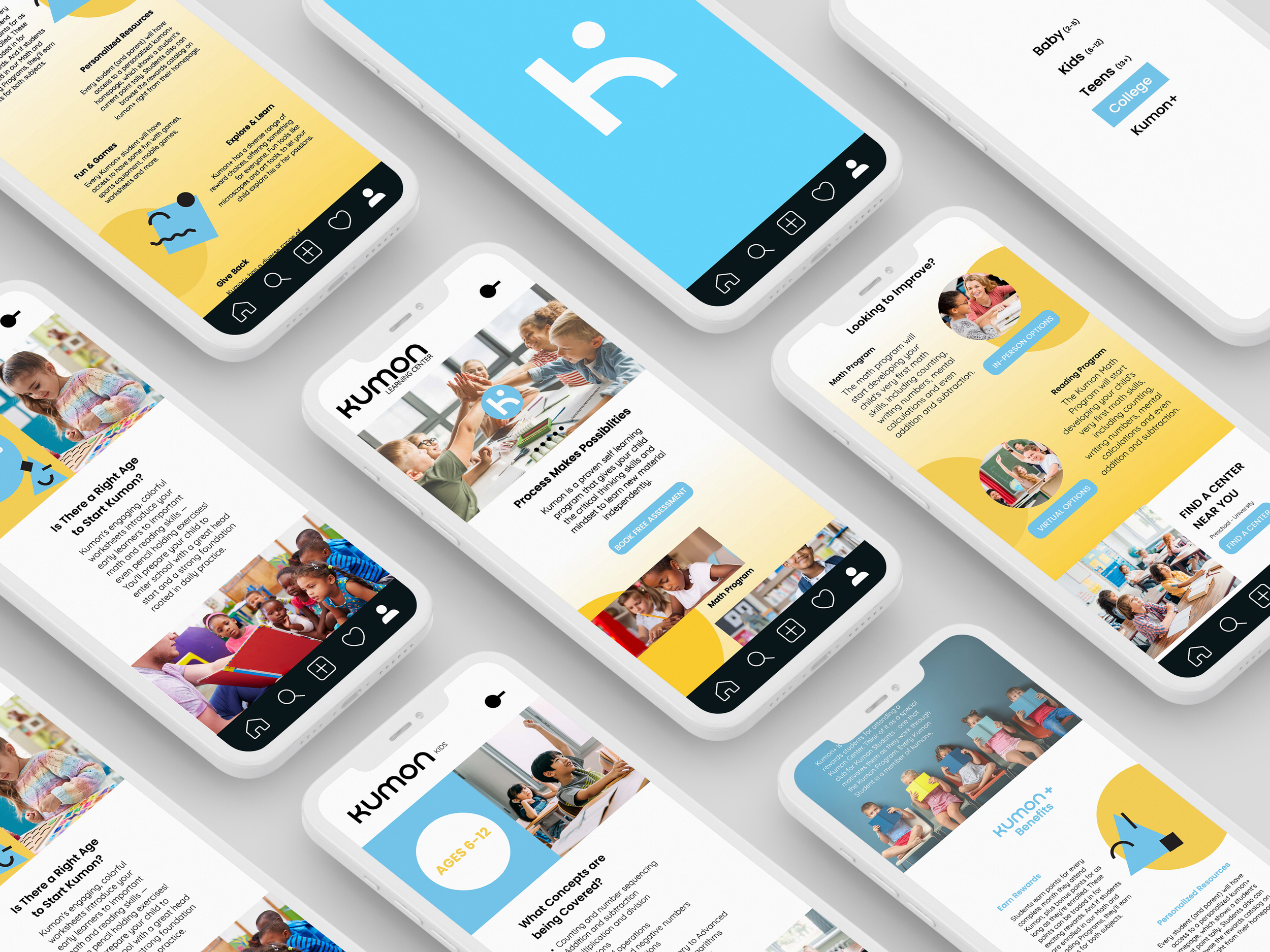
Kumon App
Kumon currently doesn’t have an app that is working against them because since covid so many of our basics have moved online. I wanted to build an app that can track progress and do some daily assignments through the app. Giving the child a higher chance to learn and engage with their audiences.


Social Media
Social media is a big part of everyone's lives including kids and parents. We want to use Kumon’s Instagram to give tips and make young kids feel less threatened by the idea of having to go to a learning center.


